Ambra Sans Font

Uploaded by Zetafonts  — Sans serif Typeface

Specimen image — coming soon
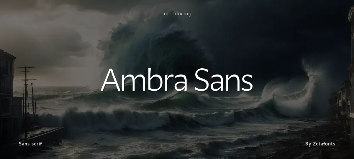
Ambra Sans font preview
License
Free for personal use
Designer
Zetafonts
  • Free for personal use
  • Free for commercial use
Download TTF
The font here is for PERSONAL/NON-COMMERCIAL USE ONLY!

To download the full font family (all weights, glyphs and numbers) and acquire the commercial license please visit our website:
https://zetafonts.com/ambra-sans

Join the exclusive Type Club to get free fonts and special offers on new releases!
https://www.zetafonts.com/typeclub

CONTACT US:
website: https://www.zetafonts.com
have a question?: info@zetafonts.com

---

Designed by Cosimo Lorenzo Pancini with Francesco Canovaro as a development and reinvention of Tarif by Andrea Tartarelli, Ambra is a humanist sans typeface family, drawn around a lively, expressive skeleton but developed with a contemporary, post-digital sensibility that implies low contrast and tall x-height.

In designing Ambra, the authors wanted to research the elusive natural signature of handmade humanist letter shapes, in the effort of preserving it while still developing all the capabilities of type as a technical tool in the digital age. Like a frail insect preserved in amber, humanist design is the "ghost in the machine" of this font, that aims at seducing the viewers with its soft, welcoming text flow, firmly opposing the rigid, formal tone of most sans serif fonts. Born to provide a useful tool to graphic designers with branding and editorial needs,   More...

Ambra develops around two subfamilies with slight but fundamental differences. The display family offers a taller x-height, optimizing readability and spacing in headings and display use, while offering a single story lowercase g to provide more consistent branding usage. The text family, on the other side, goes for a smaller x-height to give more traditional proportion to the text and removes the slight tapering in the stems to provide better rendering on screen in small formats.

Both subfamilies of Ambra develop around a wide range of seven weights with corresponding true italics, with Ambra Display sporting an extra heavy weight for maximum versatility. In total the family counts 30 fonts, each with over 600 glyphs for a wide language coverage. Open type features and glyph alternates further enrich the usage possibility of this typeface that wants to offer contemporary designer an alternative, unexpectedly human approach to contemporary sans type, softly preserving the spirit of handmade calligraphy while encasing its frail nature in a transparent, strong and powerful design language.
Size

Ambra Sans - Ambra Sans Italic Trial

Ambra Sans

Ambra Sans - Ambra Sans Light Italic Trial

Ambra Sans

Ambra Sans - Ambra Sans Light Trial

Ambra Sans

Ambra Sans - Ambra Sans Medium Italic Trial

Ambra Sans

Ambra Sans - Ambra Sans Medium Trial

Ambra Sans

Ambra Sans - Ambra Sans Regular Trial

Ambra Sans

Ambra Sans - Ambra Sans Text Black Italic Trial

Ambra Sans

Ambra Sans - Ambra Sans Text Black Trial

Ambra Sans

Ambra Sans - Ambra Sans Text Bold Italic Trial

Ambra Sans

Ambra Sans - Ambra Sans Text Bold Trial

Ambra Sans

Ambra Sans - Ambra Sans Text Book Italic Trial

Ambra Sans

Ambra Sans - Ambra Sans Text Book Trial

Ambra Sans

Ambra Sans - Ambra Sans Text Extrabold Italic Trial

Ambra Sans

Ambra Sans - Ambra Sans Text Extrabold Trial

Ambra Sans

Ambra Sans - Ambra Sans Text Italic Trial

Ambra Sans

Ambra Sans - Ambra Sans Text Light Italic Trial

Ambra Sans

Ambra Sans - Ambra Sans Text Light Trial

Ambra Sans

Ambra Sans - Ambra Sans Text Medium Italic Trial

Ambra Sans

Ambra Sans - Ambra Sans Text Medium Trial

Ambra Sans

Ambra Sans - Ambra Sans Text Regular Trial

Ambra Sans

Ambra Sans - Ambra Sans Black Italic Trial

Ambra Sans

Ambra Sans - Ambra Sans Black Trial

Ambra Sans

Ambra Sans - Ambra Sans Bold Italic Trial

Ambra Sans

Ambra Sans - Ambra Sans Bold Trial

Ambra Sans

Ambra Sans - Ambra Sans Book Italic Trial

Ambra Sans

Ambra Sans - Ambra Sans Book Trial

Ambra Sans

Ambra Sans - Ambra Sans Extrabold Italic Trial

Ambra Sans

Ambra Sans - Ambra Sans Extrabold Trial

Ambra Sans

Ambra Sans - Ambra Sans Heavy Italic Trial

Ambra Sans

Ambra Sans - Ambra Sans Heavy Trial

Ambra Sans

abcdefghijklmnopqrstuvwxyz

ABCDEFGHIJKLMNOPQRSTUVWXYZ

0123456789   (!#$%&/.|*@?:;)


Typography

Great type turns words into design.

THE FIVE BOXING WIZARDS JUMP QUICKLY

the quick brown fox jumps over the lazy dog

$1,234.56 · 25% off · 09:45 AM · (2024) · #Fontlala


Every typeface has a voice. Some whisper, some shout — and the best ones say exactly what you mean before a single word is read.

Pick a font that fits your idea, set it with care, and let the letters do the talking. From bold headlines to the smallest caption, good type stays clear at every size — clean curves, even spacing, and characters that feel at home together.

A well-made font carries your message across posters, screens, packaging and print without ever getting in the way. That is the quiet craft of typography: structure you feel, but rarely notice. 0123456789 — the details matter.

A
B
C
D
E
F
G
H
I
J
K
L
M
N
O
P
Q
R
S
T
U
V
W
X
Y
Z
a
b
c
d
e
f
g
h
i
j
k
l
m
n
o
p
q
r
s
t
u
v
w
x
y
z
0
1
2
3
4
5
6
7
8
9
.
,
:
;
!
?
&
@
#
%
*
(
)
[
]
{
}
/
\
|
-
+
=
<
>
~
^
_
"
'
`
£
$
¥
©
®
°
§
«
»

You might also like