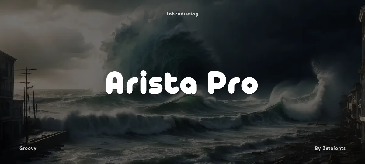
Arista Pro Font

Uploaded by Zetafonts  — Groovy Typeface

Specimen image — coming soon

Arista Pro font preview
License
Free for personal use
Designer
Zetafonts
  • Free for personal use
  • Free for commercial use
Download TTF
This font is for PERSONAL/NON-COMMERCIAL USE ONLY!

Download full version and commercial license:
http://www.zetafonts.com/arista-2-0

For more info about our licenses:
http://www.zetafonts.com/licensing

Join the exclusive Type Club to get free fonts and special offers on new releases!
https://www.zetafonts.com/typeclub

---

Arista Pro is the definitive version of the successful Arista typeface, designed by Francesco Canovaro, first released in 2007 as Arista Z and then reissued as Arista 2.0 in 2010. The pro version of Arista features the geometric and soft approach of the original typeface but comes in a full range of weights and two alternate versions (Arista Pro Regular and Arista Pro alternate version). The typeface has been expanded with the inclusion of Greek and Cyrillic alphabets as well as an extended range of latin characters. A companion icon typeface, Arista Pro Icon, has been developed, allowing for variable-width monoline icons that can be used to faultlessly match the typeface line width, up to semibold weight.

PLEASE NOTE: Arista 2.0 and [z] Arista are no longer supported!
Size

Arista Pro - Arista Pro Alternate Bold Trial

Arista Pro

Arista Pro - Arista Pro Alternate Fat Trial

Arista Pro

Arista Pro - Arista Pro Alternate Light Trial

Arista Pro

Arista Pro - Arista Pro Bold Trial

Arista Pro

Arista Pro - Arista Pro Fat Trial

Arista Pro

Arista Pro - Arista Pro Light Trial

Arista Pro

abcdefghijklmnopqrstuvwxyz

ABCDEFGHIJKLMNOPQRSTUVWXYZ

0123456789   (!#$%&/.|*@?:;)


Typography

Great type turns words into design.

THE FIVE BOXING WIZARDS JUMP QUICKLY

the quick brown fox jumps over the lazy dog

$1,234.56 · 25% off · 09:45 AM · (2024) · #Fontlala


Every typeface has a voice. Some whisper, some shout — and the best ones say exactly what you mean before a single word is read.

Pick a font that fits your idea, set it with care, and let the letters do the talking. From bold headlines to the smallest caption, good type stays clear at every size — clean curves, even spacing, and characters that feel at home together.

A well-made font carries your message across posters, screens, packaging and print without ever getting in the way. That is the quiet craft of typography: structure you feel, but rarely notice. 0123456789 — the details matter.

A
B
C
D
E
F
G
H
I
J
K
L
M
N
O
P
Q
R
S
T
U
V
W
X
Y
Z
a
b
c
d
e
f
g
h
i
j
k
l
m
n
o
p
q
r
s
t
u
v
w
x
y
z
0
1
2
3
4
5
6
7
8
9
.
,
:
;
!
?
&
@
#
%
*
(
)
[
]
{
}
/
\
|
-
+
=
<
>
~
^
_
"
'
`
£
$
¥
©
®
°
§
«
»

You might also like