
Specimen image — coming soon
- License
- Free for personal use
- Designer
- Zetafonts
- Free for personal use
- Free for commercial use
To download the full font family (all weights, glyphs and numbers) and acquire the commercial license please visit our website:
https://www.zetafonts.com/arsenica
Join the exclusive Type Club to get free fonts and special offers on new releases!
https://www.zetafonts.com/typeclub
CONTACT US:
website: https://www.zetafonts.com
have a question?: info@zetafonts.com
---
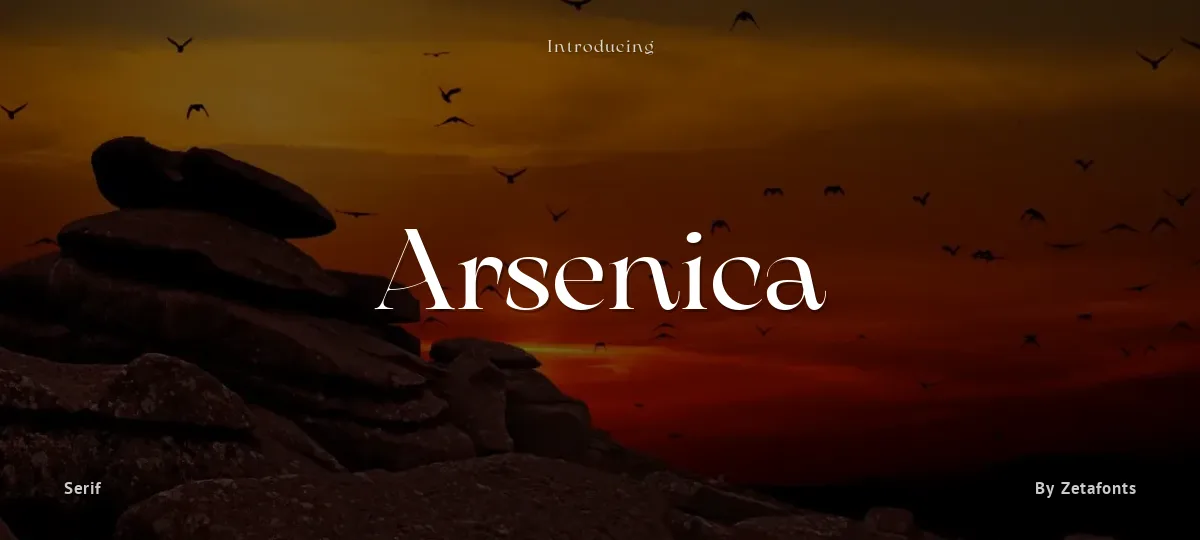
Arsenica is a serif typeface designed by Francesco Canovaro for Zetafonts, and developed by a design team including Mario De Libero, Andrea Tartarelli and Cosimo Lorenzo Pancini.
The design of Arsenica takes its inspiration from italian poster design at the beginning of the century, a time where typography, lettering and illustration where closely interwoven. Dawning nationalist movements, rather than using the modernist language, pushed on traditional Old Style letterforms often imbued with Art Nouveau and Deco sensibility. Artists like Giorgio Muggiani not only illustrated posters for Cinzano, Pirelli and Rinascente, but also provided logo design for newspapers, like "Il Popolo d'Italia".
Starting from this mix of eclectic influences, Canovaro first developed the Arsenica Antiqua family, designed as display typeface that keeps the original Old Style low-contrast, wide proportions and quirky stylistic inventions. These where then distilled in a high contrast, Arsenica Display family, expanding the weight range to include both poster, ultrabold weights and lighter weights that give the design a distinct calligraphic flavour. Bringing the letterforms into contemporary taste meant also developing alternate letterforms that were included in the Arsenica Alternate family, that drops the art nouveau details in favour of a more controlled modern serif aesthetic. Finally, Arsenica Text was developed by expanding the design space in the optical size axis, creating a low contrast, strongly readable old style typeface family, with a reduced weight set, oriented for long body copy typesetting. More...
The final result is a superfamily of 41 weights, covering the design space with an expanded charset of over nine hundred glyphs, with full coverage of over two hundred languages using latin and cyrillic alphabets. All the weights of Arsenica come with a full set of open type features allowing to explore its vintage-inspired visual inventions thanks to stylistic sets, discretionary ligatures, contextual alternates and positional numbers. Two variable typefaces are included in the full family, allowing you to explore the design space and precisely control not only the weight but also the optical size design variations.
Arsenica - Trial Bold
Arsenica - Trial Bold Italic
Arsenica - Trial Demibold
Arsenica - Trial Demibold Italic
Arsenica - Trial Extrabold
Arsenica - Trial Extrabold Italic
Arsenica - Trial Italic
Arsenica - Trial Light
Arsenica - Trial Light Italic
Arsenica - Trial Medium
Arsenica - Trial Medium Italic
Arsenica - Trial Regular
Arsenica - Trial Thin
Arsenica - Trial Thin Italic
abcdefghijklmnopqrstuvwxyz
ABCDEFGHIJKLMNOPQRSTUVWXYZ
0123456789 (!#$%&/.|*@?:;)
Typography
Great type turns words into design.
THE FIVE BOXING WIZARDS JUMP QUICKLY
the quick brown fox jumps over the lazy dog
$1,234.56 · 25% off · 09:45 AM · (2024) · #Fontlala
Every typeface has a voice. Some whisper, some shout — and the best ones say exactly what you mean before a single word is read.
Pick a font that fits your idea, set it with care, and let the letters do the talking. From bold headlines to the smallest caption, good type stays clear at every size — clean curves, even spacing, and characters that feel at home together.
A well-made font carries your message across posters, screens, packaging and print without ever getting in the way. That is the quiet craft of typography: structure you feel, but rarely notice. 0123456789 — the details matter.
Report a violation
Reporting Arsenica. Tell us what's wrong and we'll investigate.