Autoradiographic Font

Uploaded by Typodermic Fonts  — Sans serif Typeface

Specimen image — coming soon
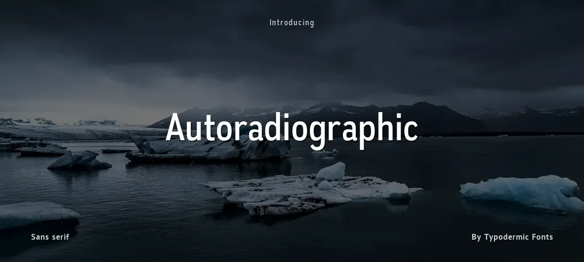
Autoradiographic font preview
License
Free for commercial use
Designer
Typodermic Fonts
  • Free for personal use
  • Free for commercial use
Download OTF
Autoradiographic captures the utilitarian spirit of mid-century American lettering with a modern edge. Its condensed sans forms, square-ended, tightly built, and subtly curved, evoke stenciled lab doors and industrial signage from the atomic age. Five weights with italics provide range from precise labeling to bold display use, while the italics bring a hand-painted confidence rather than classical slant. Clear numerals and sturdy symbols echo vintage data plates, giving text an authentic, functional tone. Designed for designers who appreciate postwar grit and modern polish, Autoradiographic delivers sharp, timeless industrial character.

These fonts include a license that allows free commercial use: sometimes referred to as a desktop license. This allows you to install the fonts on a computer and use them to create posters, web graphics, game graphics, t-shirts, videos, signs, logos and more. Read the license agreement for details. If you'd like to embed these fonts in an app, on the web or anything that's not covered by the desktop license agreement, visit the link below. You'll find distributors who offer different types of licenses, or you can contact me for help.
https://typodermicfonts.com/autoradiographic
Size

Autoradiographic - Rg It

Autoradiographic

Autoradiographic - Rg

Autoradiographic

abcdefghijklmnopqrstuvwxyz

ABCDEFGHIJKLMNOPQRSTUVWXYZ

0123456789   (!#$%&/.|*@?:;)


Typography

Great type turns words into design.

THE FIVE BOXING WIZARDS JUMP QUICKLY

the quick brown fox jumps over the lazy dog

$1,234.56 · 25% off · 09:45 AM · (2024) · #Fontlala


Every typeface has a voice. Some whisper, some shout — and the best ones say exactly what you mean before a single word is read.

Pick a font that fits your idea, set it with care, and let the letters do the talking. From bold headlines to the smallest caption, good type stays clear at every size — clean curves, even spacing, and characters that feel at home together.

A well-made font carries your message across posters, screens, packaging and print without ever getting in the way. That is the quiet craft of typography: structure you feel, but rarely notice. 0123456789 — the details matter.

A
B
C
D
E
F
G
H
I
J
K
L
M
N
O
P
Q
R
S
T
U
V
W
X
Y
Z
a
b
c
d
e
f
g
h
i
j
k
l
m
n
o
p
q
r
s
t
u
v
w
x
y
z
0
1
2
3
4
5
6
7
8
9
.
,
:
;
!
?
&
@
#
%
*
(
)
[
]
{
}
/
\
|
-
+
=
<
>
~
^
_
"
'
`
£
$
¥
©
®
°
§
«
»

You might also like