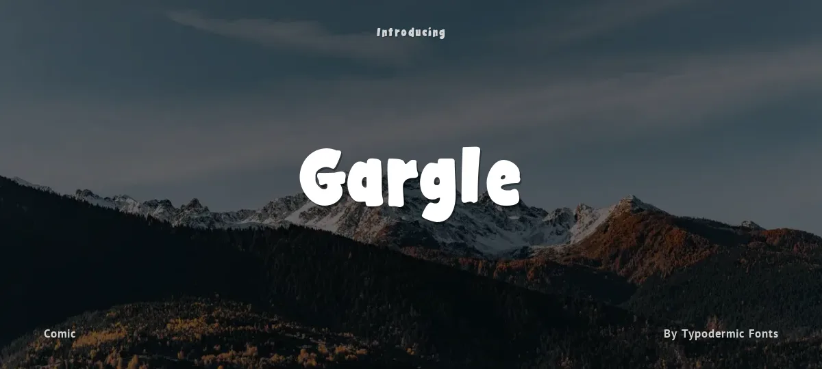
Gargle is a light, hand-drawn newspaper comic dialog typeface designed to harmonize with an informal felt-tip pen style. But its not just for comics. Gargle is also suited to imitating the look of an informal fanzine, indie album notes or hand drawn signs.
Three widths are provided to allow word-fit flexibility. In pre-digital comic design, copy-fitting wasnt the only way to squeeze words into word balloons. If you look at old newspaper comics, you can see how some artists would squeeze and stretch words to make them fit into a word balloon. With Gargles three widths, youll have some flexibility that you normally couldnt achieve with a single width typeface. Its recommended that the bulk of your comic dialog is displayed using capitals. Sometimes, a lowercase letter looks appropriate in words such as iPAD or McKENNA. Lowercase can also be used to indicate reading, thought, radio, vocalizations, whispering etc. In comic dialog emphasis, italics arent enough. Italics can still be used to indicate special terms, radio or whispering but if you want to shout, you have a choice of bold or bold italic. Youll probably find that the bold italic is the most effective way to emphasize individual words in a sentence while the upright bold works best for yell balloons or sound effects. In OpenType savvy applications, Gargles letters, numerals, commas, questions marks, exclamation marks and periods automatically shuffle a set of three variations to help create the illusion of hand lettering.
In comics, traditionally, the lone letter I is supposed to have serifs while an I in the middle of a word should be plain. Gargle contains OpenType programming which automatically adds serifs the I in words such as I, Im and initials like M.I.A. Serifs are also added to the I when followed by a lowercase L for words such as Illinois. Of course, the serifed I has three shuffled variations as well. Gargle contains some useful comic symbols, but you wont need to look them up in a glyph table. Just use the handy shortcodes below and the symbol will automatically be substituted. These shortcodes will even work in other languages.
More...
<< >> = whiskers
((swirl)) a coil...handy for obfuscating curses
((zigzag)) an angry vertical scribble
((skull)) a skull and crossbones (solid version in the bold styles)
((scribble)) a criss-cross scribble
((cloud)) a white cloud with lightning (black cloud in the bold styles)
((scrawl)) or ((scribble2)) = a long, horizontal scribble. (angrier in the bold styles)
((lightning)) a lightning bolt (solid version in the bold styles)
((!!!)) A cluster of three heavy exclamation points (solid version in the bold styles)
((knife)) a dagger (solid version in the bold styles)
((star)) a big star (solid version in the bold styles)
((star2)) a medium star (solid version in the bold styles)
((star3)) or ((stars)) two small stars (solid version in the bold styles)
Most Latin-based European writing systems are supported, including the following languages. Afaan Oromo, Afar, Afrikaans, Albanian, Alsatian, Aromanian, Aymara, Bashkir (Latin), Basque, Belarusian (Latin), Bemba, Bikol, Bosnian, Breton, Cape Verdean, Creole, Catalan, Cebuano, Chamorro, Chavacano, Chichewa, Crimean Tatar (Latin), Croatian, Czech, Danish, Dawan, Dholuo, Dutch, English, Estonian, Faroese, Fijian, Filipino, Finnish, French, Frisian, Friulian, Gagauz (Latin), Galician, Ganda, Genoese, German, Greenlandic, Guadeloupean Creole, Haitian Creole, Hawaiian, Hiligaynon, Hungarian, Icelandic, Ilocano, Indonesian, Irish, Italian, Jamaican, Kaqchikel, Karakalpak (Latin), Kashubian, Kikongo, Kinyarwanda, Kirundi, Kurdish (Latin), Latvian, Lithuanian, Lombard, Low Saxon, Luxembourgish, Maasai, Makhuwa, Malay, Maltese, Māori, Moldovan, Montenegrin, Ndebele, Neapolitan, Norwegian, Novial, Occitan, Ossetian (Latin), Papiamento, Piedmontese, Polish, Portuguese, Quechua, Rarotongan, Romanian, Romansh, Sami, Sango, Saramaccan, Sardinian, Scottish Gaelic, Serbian (Latin), Shona, Sicilian, Silesian, Slovak, Slovenian, Somali, Sorbian, Sotho, Spanish, Swahili, Swazi, Swedish, Tagalog, Tahitian, Tetum, Tongan, Tshiluba, Tsonga, Tswana, Tumbuka, Turkish, Turkmen (Latin), Tuvaluan, Uzbek (Latin), Venetian, Vepsian, Võro, Walloon, Waray-Waray, Wayuu, Welsh, Wolof, Xhosa, Yapese, Zapotec Zulu and Zuni.
The fonts included in this archive are released under a no rights reserved Creative Commons Zero license. Please do not ask permission to do anything with these fonts. Whatever you want to do with these fonts, the answer will be yes. Please read about the CC0 Public Domain license before contacting me.
https://creativecommons.org/publicdomain/zero/1.0/
To the extent possible under law, Raymond Larabie has waived all copyright and related or neighboring rights to the fonts in this archive. This work is published from: Japan.