
Minikin Font
Uploaded by Graham Herrli — Various Typeface
Specimen image — coming soon
- License
- Free for commercial use
- Designer
- Graham Herrli
- Free for personal use
- Free for commercial use
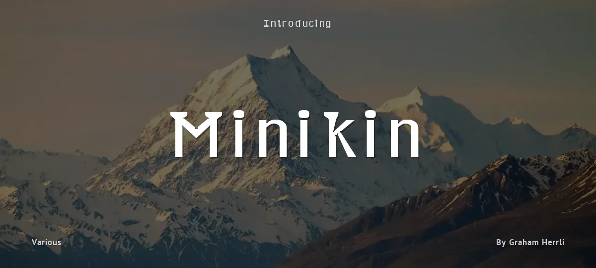
I call it a semi-serif font because it only has serifs on ascenders and descenders. By making the ascenders and descenders so wide, I was able to shrink their height. Its fairly common for descenders to take up about 20% of a fonts height. In Minikin, the descenders only take up 15% of the height. The ascenders are also compressed to take only 15% (measuring between x-height and cap-height). A few characters(,|, {,},l, and) extend beyond the cap-height by a further 3%. This leaves a full 67% of the height for main body of most letters. Some other things that make it legible at small sizes are:
(1) It has low stroke contrast. The thickest strokes are about 13% of the height. The thinnest are about 8%.
(2) It has thick strokes, which prevents it from looking washed-out at small sizes. (At larger sizes, its thick strokes and vertical emphasis make it look a bit like a blackletter.)
(3) Its counters are very open. Rather than anchoring curves with one point, I often anchored them with two, making the circular areas bulge toward becoming rectangles.
(4) Where whitespace points in toward the letter, a little additional whitespace has been hollowed out to prevent that corner from filling with ink when printed. For an example of these hollows, view the ampersand around size 72.
(5) The letters are spaced generously: usually each of the bearings (the margins on each letters edges) is about as wide as a stroke, which means that the space between each letter pair is almost two strokes wide.
You can use this font under a Creative Commons Attribution 2.0 Generic license (https://creativecommons.org/licenses/by/2.0/).
If you do use it, please send an email to herrli <dot> ch [at] hotmail <dot> com to let me know. (No obligation to email, but it'll give me a warm fuzzy feeling if you do.) I also welcome donations using dafont.com's donate link.
Minikin - Regular
abcdefghijklmnopqrstuvwxyz
ABCDEFGHIJKLMNOPQRSTUVWXYZ
0123456789 (!#$%&/.|*@?:;)
Typography
Great type turns words into design.
THE FIVE BOXING WIZARDS JUMP QUICKLY
the quick brown fox jumps over the lazy dog
$1,234.56 · 25% off · 09:45 AM · (2024) · #Fontlala
Every typeface has a voice. Some whisper, some shout — and the best ones say exactly what you mean before a single word is read.
Pick a font that fits your idea, set it with care, and let the letters do the talking. From bold headlines to the smallest caption, good type stays clear at every size — clean curves, even spacing, and characters that feel at home together.
A well-made font carries your message across posters, screens, packaging and print without ever getting in the way. That is the quiet craft of typography: structure you feel, but rarely notice. 0123456789 — the details matter.
Report a violation
Reporting Minikin. Tell us what's wrong and we'll investigate.