Bebas Neue
Free for commercial use

Uploaded by Indian Type Foundry — Sans serif Typeface
Specimen image — coming soon
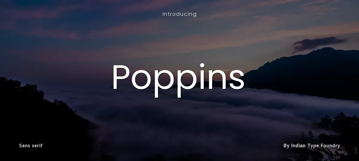
Geometric sans serif typefaces have been a popular design tool ever since these actors took to the world’s stage. Poppins is one of the new comers to this long tradition. With support for the Devanagari and Latin writing systems, it is an internationalist take on the genre.
Many of the Latin glyphs (such as the ampersand) are more constructed and rationalist than is typical. The Devanagari design is particularly new, and is the first ever Devanagari typeface with a range of weights in this genre. Just like the Latin, the Devanagari is based on pure geometry, particularly circles.
Each letterform is nearly monolinear, with optical corrections applied to stroke joints where necessary to maintain an even typographic color. The Devanagari base character height and the Latin ascender height are equal; Latin capital letters are shorter than the Devanagari characters, and the Latin x-height is set rather high.
The Devanagari is designed by Ninad Kale. The Latin is by Jonny Pinhorn. To contribute, see
Poppins - Thin
Poppins - Thin Italic
Poppins - Extra Light
Poppins - Extra Light Italic
Poppins - Light
Poppins - Light Italic
Poppins - Regular
Poppins - Italic
Poppins - Medium
Poppins - Medium Italic
Poppins - Semi Bold
Poppins - Semi Bold Italic
Poppins - Bold
Poppins - Bold Italic
Poppins - Extra Bold
Poppins - Extra Bold Italic
Poppins - Black
Poppins - Black Italic
abcdefghijklmnopqrstuvwxyz
ABCDEFGHIJKLMNOPQRSTUVWXYZ
0123456789 (!#$%&/.|*@?:;)
Typography
Great type turns words into design.
THE FIVE BOXING WIZARDS JUMP QUICKLY
the quick brown fox jumps over the lazy dog
$1,234.56 · 25% off · 09:45 AM · (2024) · #Fontlala
Every typeface has a voice. Some whisper, some shout — and the best ones say exactly what you mean before a single word is read.
Pick a font that fits your idea, set it with care, and let the letters do the talking. From bold headlines to the smallest caption, good type stays clear at every size — clean curves, even spacing, and characters that feel at home together.
A well-made font carries your message across posters, screens, packaging and print without ever getting in the way. That is the quiet craft of typography: structure you feel, but rarely notice. 0123456789 — the details matter.
Reporting Poppins. Tell us what's wrong and we'll investigate.