
Specimen image — coming soon
- License
- Free for personal use
- Designer
- K-Type
- Free for personal use
- Free for commercial use
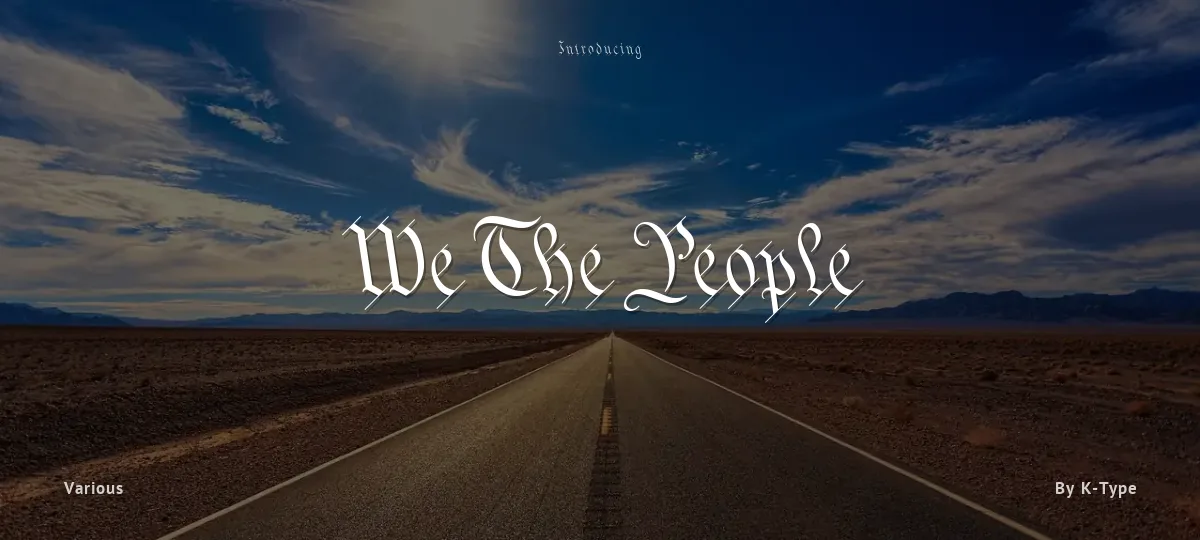
The original Constitution document was transcribed onto parchment by Jacob Shallus, a Pennsylvania Assistant Clerk, over a weekend in 1787. Shalluss biographer, Arthur Plotnik ('The Man Behind the Quill', 1987), notes that he was paid $30, a modest monthly wage at the time. He also suggests that the calligraphic headings, We the People and Article, may have been inserted by Shalluss 14 year old trainee son, Francis,
The manner in which the Article headings are squeezed into the space Shallus allowed for them suggests a second handand perhaps not a very experienced one.
The unconventional backslant of the headings would seem to support this contention, and at the end of the document there is perhaps a novices inconsistency in the structure of the letter n between that used for done and those used for In Witness. However, one has to admire the elegant swagger of the wavy t, h and l which the K-Type font extends to the b, f and k. Also, the simpler, Schwabacher-style W, an enlarged version of the lowercase w, is a little less flamboyant than the capital W from the German and Square texts in Bickhams manuals.
For designers using OpenType-aware applications, the typeface includes some Alternates, including a Bickham-style W, the letters t, h and n with added flourishes, two simpler forms of the A, and a few roman numerals for numbering articles. Also some ornamental flourishes and a round middle dot/decimal point. Punctuation marks are drawn in square, calligraphic style, but an alternative round period/full stop, for use with currency and numerals, is available at the period centered position (though placed on the baseline), accessed by Shift Option 9 on a Mac, or Alt 0183 on Windows. The full phrase, We the People, has been placed at the trademark keystroke and can be accessed by Shift Option 2 on a Mac, or Alt 0153 on Windows. More...
For designers who find the backslant awkward or unpleasant, the licensed typeface is available from k-type.com and includes two additional fonts which have a vertical aspect that may be more conducive to graphic design layouts. We The People Upright and We The People Upright Bold both retain the distinctive style, and the heavier weight is only slightly emboldened, just enough to add some punch.
The original, backslanted We The People font is free for personal use, and can be used freely by students and teachers at schools, colleges and universities, and by educational institutions themselves. The free font can also be used without licensing by public charities, museums, and libraries.
We The People - Regular
abcdefghijklmnopqrstuvwxyz
ABCDEFGHIJKLMNOPQRSTUVWXYZ
0123456789 (!#$%&/.|*@?:;)
Typography
Great type turns words into design.
THE FIVE BOXING WIZARDS JUMP QUICKLY
the quick brown fox jumps over the lazy dog
$1,234.56 · 25% off · 09:45 AM · (2024) · #Fontlala
Every typeface has a voice. Some whisper, some shout — and the best ones say exactly what you mean before a single word is read.
Pick a font that fits your idea, set it with care, and let the letters do the talking. From bold headlines to the smallest caption, good type stays clear at every size — clean curves, even spacing, and characters that feel at home together.
A well-made font carries your message across posters, screens, packaging and print without ever getting in the way. That is the quiet craft of typography: structure you feel, but rarely notice. 0123456789 — the details matter.
Report a violation
Reporting We The People. Tell us what's wrong and we'll investigate.